Power BI · Data Visualization · DAX

Pet Shopping Tracker · Power BI Dashboard

Seven Power BI reports built on top of the Shopping Tracker Database, turning the same pet product pricing data from the SQL project into visual, at-a-glance comparisons across brands, categories, products, and stores.

type: personal project · tool: Power BI Desktop · status: in progress · July 2026

The Problem

SQL answers the question. A dashboard makes the answer obvious.

The Shopping Tracker Database project could already answer questions like "which store is cheapest for this product" or "what's the average price by category," but the answers lived in query result grids. Power BI turns that same data into visuals a non-technical stakeholder could scan in seconds: which brands run expensive, which stores consistently undercut the rest, and where a single product's price swings the most across retailers.

Each report connects directly to the same normalized tables (Products, Stores, and StorePrices), so the visuals stay backed by the same relational structure, not a flattened export.

At a glance

  • 7 Power BI reports
  • Built on the Shopping Tracker Database schema
  • Power Query for data shaping
  • DAX measures for aggregation
  • Bar charts & a sortable matrix view

The Reports

Seven angles on the same data.

Each report isolates one question: pricing by brand, by category, by product, by store, and the cheapest store for every product, so each is easy to read on its own or drop into a larger presentation.

Average Price by Brand

Ranks all 13 brands by average price. PanaKare Plus and Hill's Science Diet run highest, Pumpkin Patch Up! and Glandex lowest.
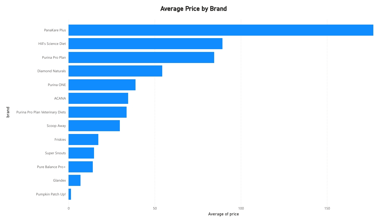
Power BI bar chart showing average price by brand, ranked from PanaKare Plus (highest) to Pumpkin Patch Up! (lowest).

Average Price by Category

Medicine has by far the highest average price of any category, well ahead of Dog Food, Cat Litter, Cat Food, and Supplements.
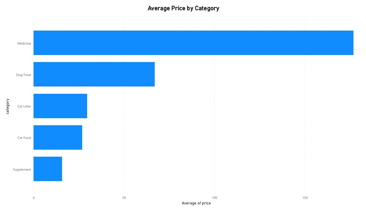
Power BI bar chart showing average price by category: Medicine, Dog Food, Cat Litter, Cat Food, Supplement.

Average Price by Product

All 19 products ranked by average price across every store that carries them, useful for spotting which individual items carry the most price risk.
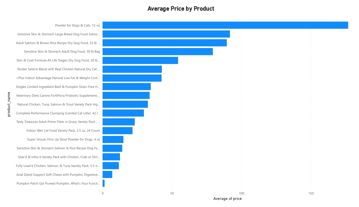
Power BI bar chart showing average price per product across all 19 products.

Average Price per Store

Costco and PetPawsRX average the highest prices across their product lines; Walmart, Amazon, and Ebay average the lowest.
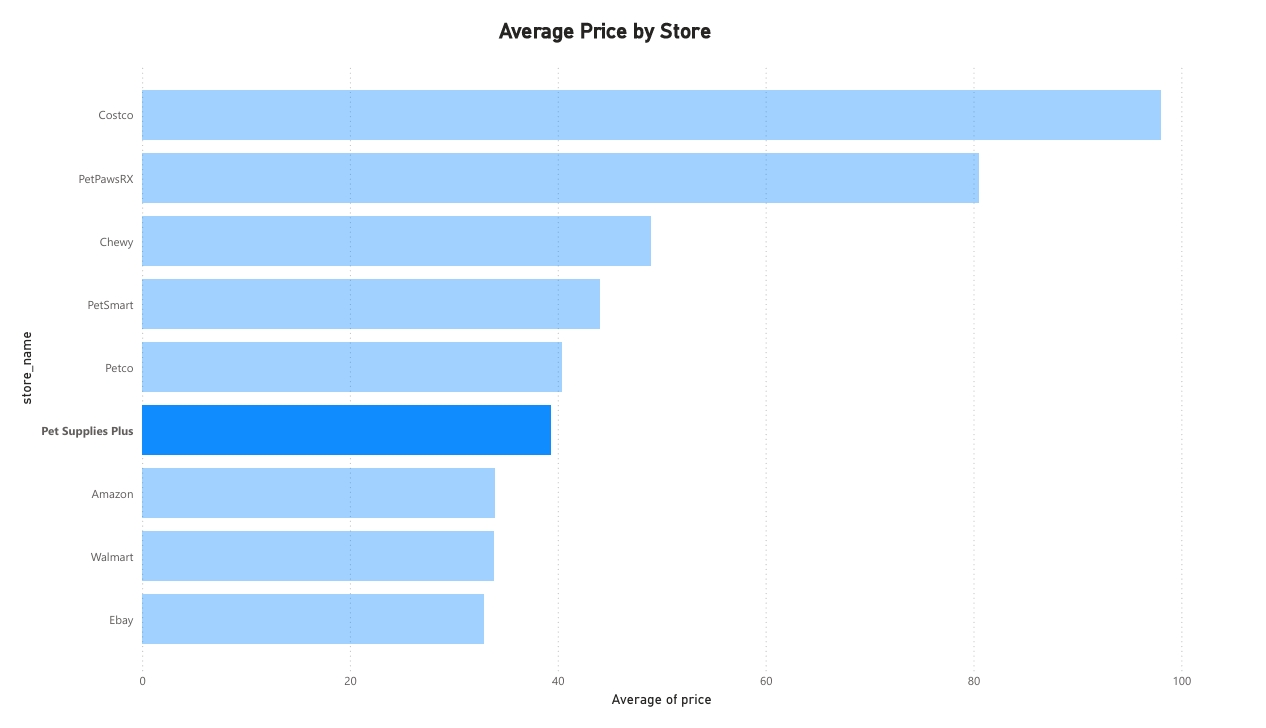
Power BI bar chart showing average price per store, from Costco (highest) to Ebay (lowest).

Cheapest Store by Product

A sortable matrix, the Power BI counterpart to the SQL project's ROW_NUMBER() CTE, showing the lowest recorded price and estimated delivery time for every product, store included.
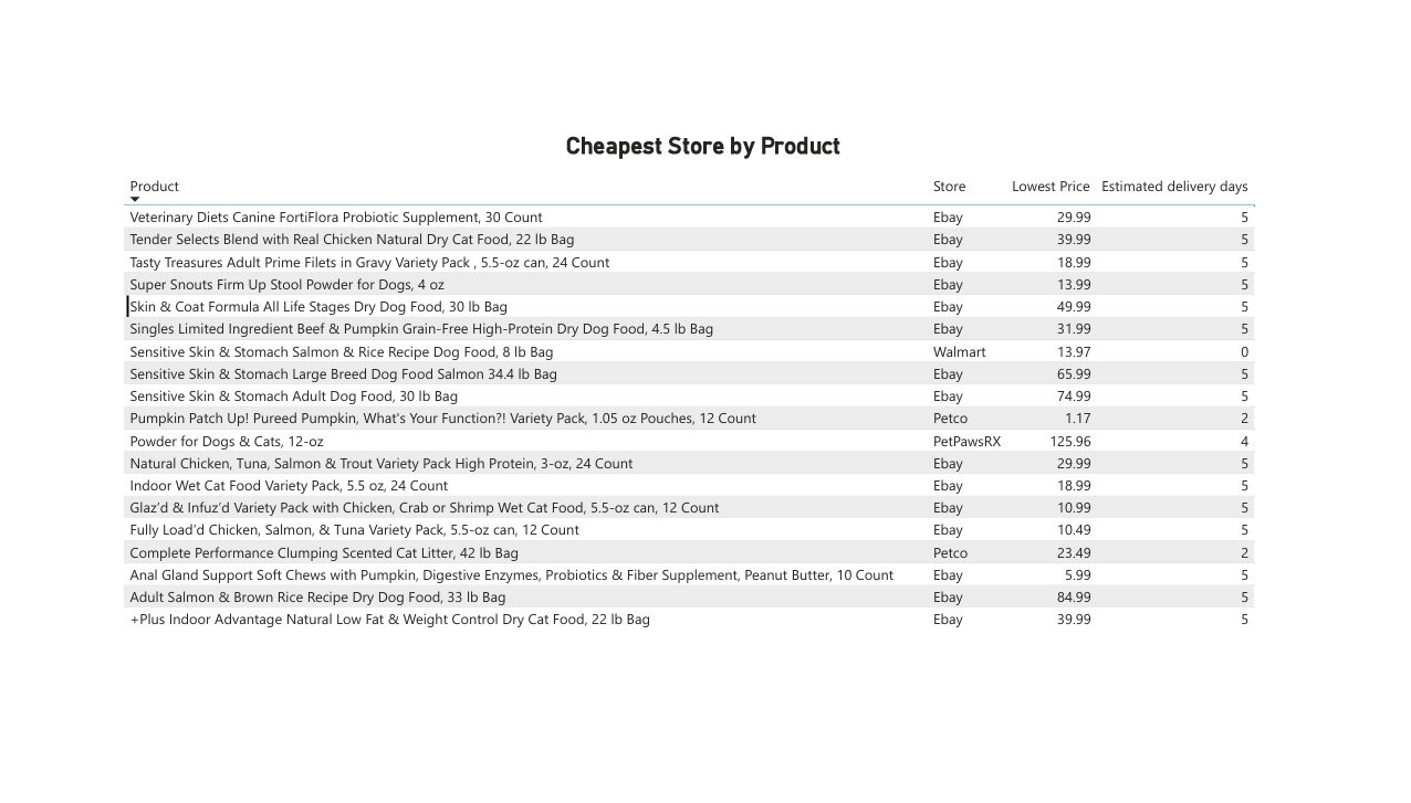
Power BI table listing the cheapest store, lowest price, and estimated delivery days for every product.

Products by Category

Cat Food and Dog Food make up the bulk of the catalog (7 and 6 products), with Cat Litter and Medicine represented by a single product each.
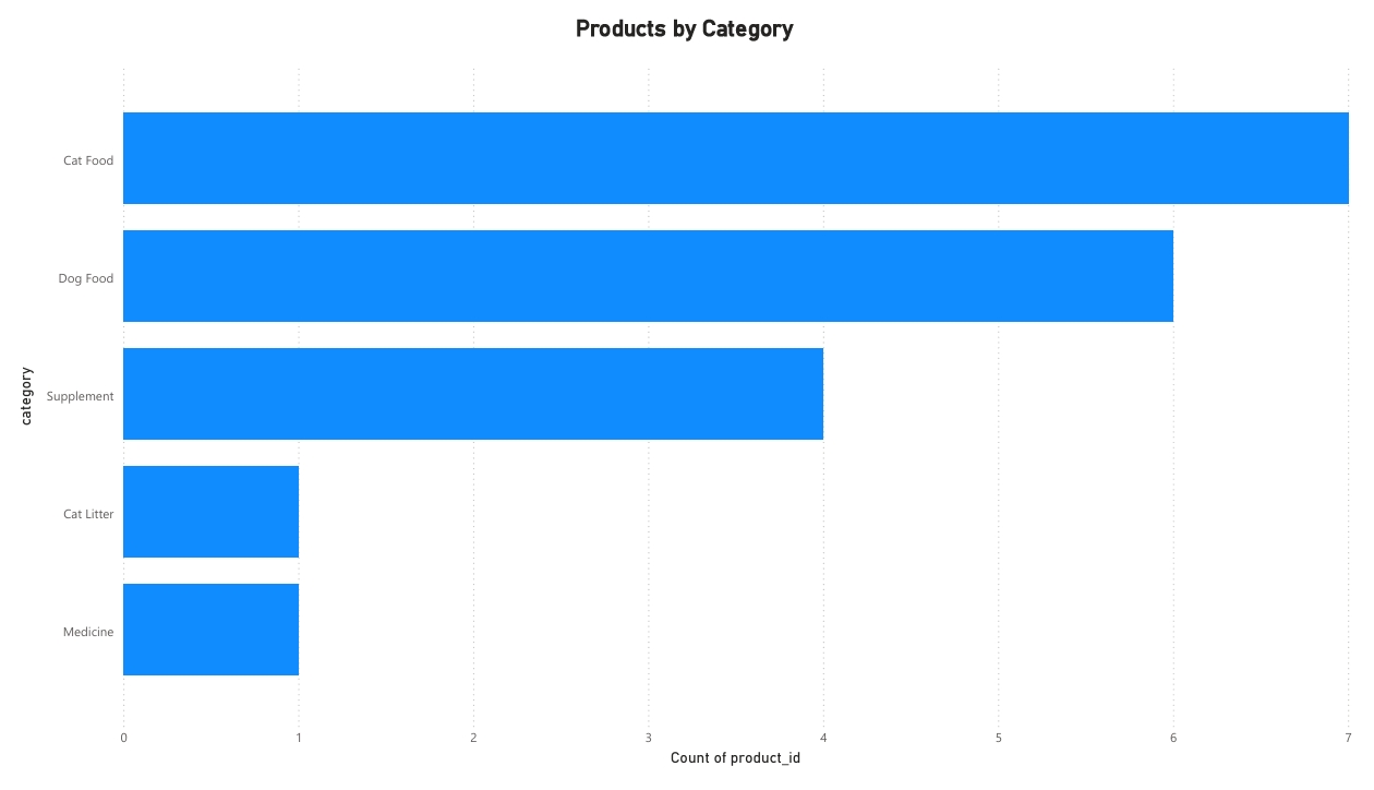
Power BI bar chart showing product count by category.

Products per Store

Chewy and Ebay carry the widest selection of tracked products; Costco carries the narrowest, consistent with its warehouse-club, bulk-item model.
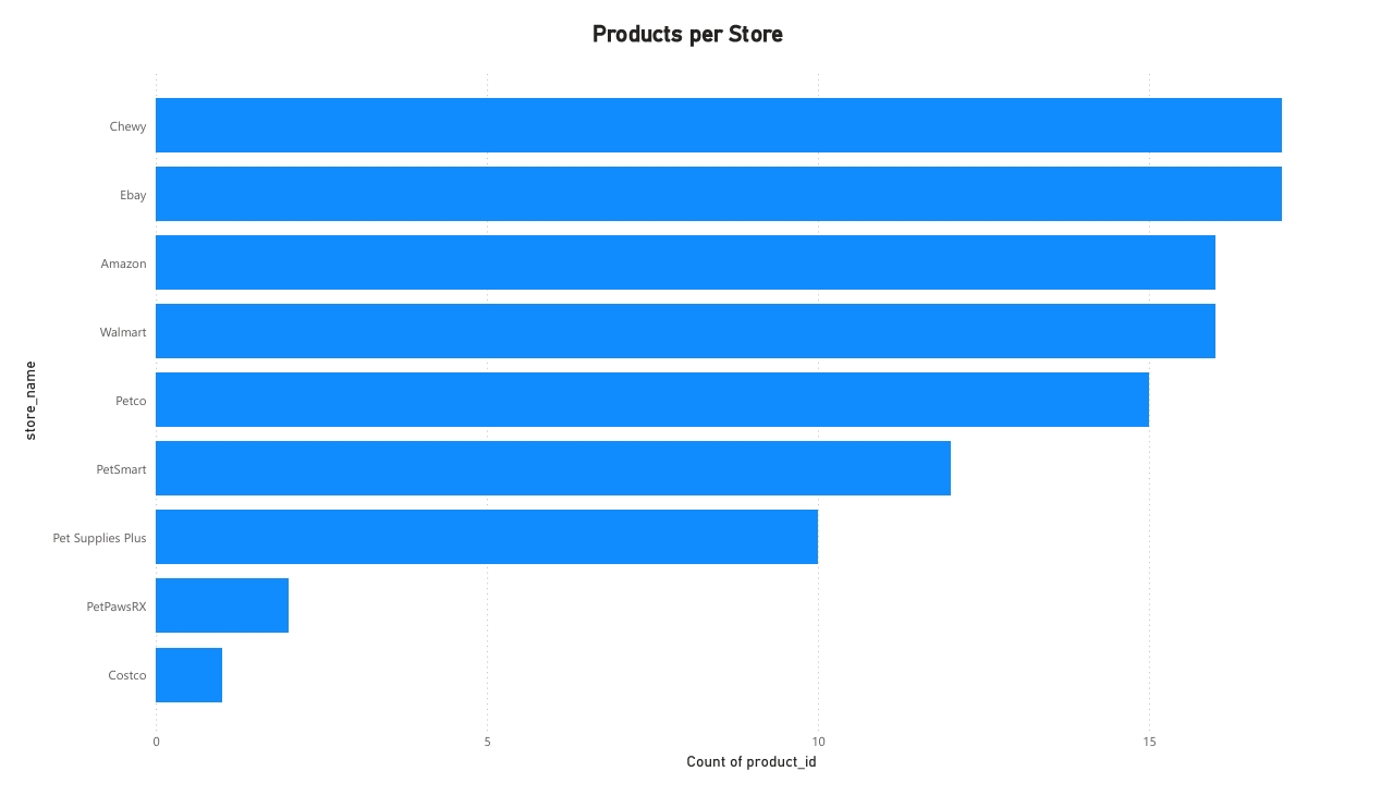
Power BI bar chart showing product count carried by each store, from Chewy (highest) to Costco (lowest).

Project Files

What's in the repo.

Each report ships as both a working .pbix file (open it in Power BI Desktop) and a static PDF export for quick viewing.

Report Download
Average Price by Brand.pbix
Average Price by Category.pbix
Average Price per Product.pbix
Average Price per Store.pbix
Cheapest Store by Product.pbix
Products by Category.pbix
Products per Store.pbix

What I Learned

The same data, doing double duty.

Building this alongside the SQL project made the connection between the two skill sets concrete: a GROUP BY and AVG() in MySQL and a DAX measure in Power BI are answering the exact same question, just for different audiences. SQL is where I'd go to investigate or validate a number; Power BI is where that number becomes something a manager or teammate can scan without needing to read a query. Splitting each report into its own focused view, rather than cramming everything onto one crowded dashboard, also made each chart easier to trust at a glance, a pattern I'd carry into QA reporting too, where a clear, single-purpose defect summary beats a dense one every time.